- Introduction
- Best Practices of Power BI
- Highlight the most important information
- Use the right visuals
- Enable Row-Level Security (RLS)
- Limit the visuals in dashboards and reports
- Use slicers sparingly
- Only import necessary fields and tables
- Use filters more
- Avoid using hierarchical filters
- Categorize the data for Power BI reports
- Use white or light background colors
- Use Microsoft AppSource certified custom visuals
- Optimize your data model
- Conclusion
Introduction
Whether you are a business owner or tech enthusiast who likes to keep a tab on the latest market trends, chances are you already know about the potential of Microsoft Power BI. However, here we’ll talk about how organizations can leverage this tool to its maximum potential with Power BI best practices.
If you’re unfamiliar with this innovative platform, here’s a quick walkthrough of Microsoft Power BI.
Best Practices of Power BI

No matter if you’re a new adopter or an experienced architect, you should always strive to add to what you can achieve with Power BI. There are lots of improvements you can do to make your reports and dashboards more secure as well as easier to understand for your users.
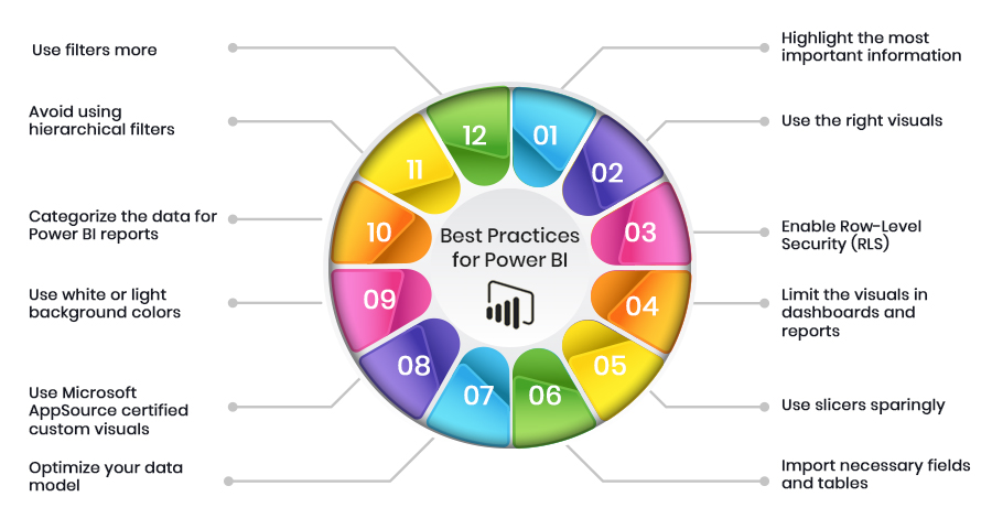
To improve the performance and security of Power BI implementations, we share our 12 best practices for developers.
- Highlight the most important information
To make the information structured and easily consumable, you should effectively accentuate the important parts of the report. For starters, you should only pin visuals that contain crucial data. You should make the information noticeable. If all of your important visuals look the same, it will be hard for your users to focus on what’s important.
Here’s how you can highlight the most important information: increase the text size, choose visual’s colors that stand out, or use the “Card” visual. No matter the method you use, the objective is to make the most important data noticeable to your users.
- Use the right visuals
In Power Bi, the visuals look eccentric and catching. But the appearance doesn’t matter that much. Using various visuals just for the sake of it won’t be much effective. Your visuals should serve a specific purpose and should be easily understandable.
- Enable Row-Level Security (RLS)
With RLS, Power BI only imports the data that the user is authorized to view by restricting access to certain data rows of a user based on his role. One of the benefits of RLS is that it makes the design and coding of your application’s security simpler and easier.
- Limit the visuals in dashboards and reports
As per Microsoft’s Optimization guide for Power BI, the placement of numerous visuals in a report slows down its performance. You should restrict grids to less than 1 per page and widget visuals to less than 8 per report page. Also, restrict pages to less than 30 points and tiles to less than 10 per dashboard.
- Use slicers sparingly
Power BI slicers are a great way of letting users navigate information, but they come at a performance cost. Each slicer generates two queries: one of them fetches the data and the other gets selection details. Too many slicers negatively impact report performance.
- Only import necessary fields and tables
You should keep the model as narrow and lean as possible by importing only the necessary fields and tables. Power BI works on columnar indexes where longer and leaner tables are preferred.
- Use more filters
Power BI filters show selected data to users on different levels such as visual, page, or report. However, the larger the data the visual needs to display, the slower it will load. And as the Power BI memory uses increases, it’s performance declines.
- Avoid using hierarchical filters
Leveraging the hierarchical filters results in high page load times. Remove the hierarchical filters to tackle poor performance in Power BI.
- Categorize the data for Power BI reports
To streamline the data in reports, Power BI provides data categorization for the Power BI reports (HBI, MBI, LBI). High Business Impact data needs users to get a policy exception for sharing the data externally. Whereas Low Business Impact and Medium Business Impact data does not need any exceptions.
- Use white or light background colors
To make the data easily readable and printer-friendly, you should only use white or light-colored backgrounds.
- Use Microsoft AppSource certified custom visuals
Power BI certified visuals are AppSource visuals certified by Microsoft that have passed rigorous quality testing. Certified custom visuals are the only custom visuals that can be viewed in Export to PowerPoint mode and email subscriptions.
- Optimize your data model
While importing the important fields and tables, you should also optimize your data model. To do it right, when dealing with numeric data, use integers instead of strings. Check your DAX functions. Be as particular as possible in your columns. This enhances the report’s responsiveness.
Conclusion
If you follow all these best practices, then rest assured that you can utilize the full potential of Microsoft Power BI. Also, it helps extremely in enhancing the overall user experience.
However, if you don’t have enough resources to spend on perfecting your Power BI performance, we’re here to help. Being one of the leading Microsoft Power BI service providers in the field, SA Technologies ensures it offers success-driven, cost-effective, and long-lasting solutions.
Our team of highly skilled Power BI consultants is knowledge experts who strive to deliver a solution that is second to none.


